Sunday, 29 January 2012

asBUILT

Since 2010 the Norwegian publisher PAX has been issuing the collection asBUILT, where in each 100 pages or so volume a significant building, built in recent years, is presented.
asBUILT makes a different approach to the building in question and instead of offering us a photo album of glossy pictures, give us the drawings. From the general plans, sections and facades until technical details and even furniture, each volume allows a good understanding of the project since its functional organization until very specific construction aspects. Personally, it would have been interesting to follow the conceptual drawings from the initial stages of the project until it got to the more concrete and “final” building, but somehow that is done by an introduction essay (in english) where the principles and concepts are generally explained. The book gets complete with a few pages with pictures, making the connection between the abstraction of the drawings and a sense of spatiality of the building.

So far 6 volumes have been published (9 more are suppose to come):
#1 Pålsbu Hydro Power station by Manthey Kula
#2 House Kollstrøm/ Østberg by Knut Hjeltnes Sivilarkitekter
#3  Østfold University College by Reiulf Ramstad Arkitekter
#4 Farm House by Jarmund / Vigsnæs
#5 Lanternen by Atelier Oslo
#6 Summerhouse by Arne Henriksen Arkitekter

Monday, 10 October 2011

Fagerborg Kindergarten

The Fagerborg Kindergarten, designed by  Reiulf Ramstad Arkitekter,  is located in central Oslo and it was finished in 2010. The previous nursery in this small city park surrounded by residential buildings from 1900-1950 was removed due its poor conditions and standards and the new one was built with a contrasting language working as a modernizing element in the area.

The kindergarten is composed by 2 units for children between 1-3 years old and 2 units for children between 3-6 years old on a total gross area of 1200m2. The functional solution allows the 4 units to work both independently and together as required. All units share a common area and a kitchen in the centre of the building. Administration is placed on the upper floor separated from children areas.
Kindergartens are very often disregarded as a typology where architectural quality and high standards must be a priority, due to budget cuts and/or clients, although these are the places where the next generation acquires their first experiences and education which might configure the adults that they will be in the future. With this in mind, Reiulf Ramstad developed an environment where physical limits and character would be stimulated by the building’s design itself.
The building evolves from a simple paralelipipedic shape which has been stressed, stretched, pulled up and compressed, both vertically and horizontally, creating this more exciting shape, meanwhile answering the basic needs of the program: a protected entrance, some comfortable sheltered outdoor areas which make the transition between the interior and the exterior, a skylight lantern to bring sunlight to the middle section of the building, etc. At the same time, this bold form is entirely wrapped with these raw and simultaneously familiar wooden slats, generating this recognizable and even traditional feeling both for adults and the children.
The inside is more neutral, covered with light pine boards with small areas of sharp colours indicating stairways and passages.  The small square windows spread all over the facades allow some interesting games of light and shadow, framing elements on the park nearby.
With an independent Oslo-based office since 1995 Reiulf Ramstad has be much applauded by his work, both in Norway and internationally, developing projects strongly based on a conceptual research, bold shapes without forgetting a sense of site and local traditions.

Wednesday, 28 September 2011

2011 UIA Gold Medal goes to Siza Vieira

The Portuguese architect was awarded with one more distinction to join the vast collection that he already has on his shelves. This time was the UIA (Union Internationale des Architectes) which gives this award every three years during its Congress, this year held in Nanjing, China.
This medal was created in 1984 with the goal of being an equivalent to the existing Nobel Prize for other areas. The prize is totally independent from national or private interests and it’s given to a living architect in “recognition of his achievements and contributions made throughout his life and career to the benefit of man and society, and the promotion of the art of architecture.”

The Gold Medal has been honoured to names like Hassan Fathy (Egypt, 1984), Charles Correa (India, 1990), Rafael Moneo (Spain, 1996), Renzo Piano (Italy, 2002) or Tadao Ando (Japan, 2005).
The name of Siza Vieira was proposed by RIBA (Royal Institute of British Architects), and the jury justified the decision saying that “Álvaro Siza defies categorisation. Each building is different yet is recognisable. His architecture cannot be duplicated but is a model for young architects. He has never succumbed to facility or fashion. As “the architect“ of the last quarter of the 20th century his work continues into the 21st, constantly pushing forward the level of the challenges facing the profession.
From the Portuguese Embassy in Tokyo the architect declared that “(the award) is a big pleasure (…) But it will not change anything on his life or in his vision of the world as a professional. The awards bring one some joy, they are also a way of getting to know ourselves better.”

Wednesday, 21 September 2011

Villa Wormdal / Haug – Jensen & Skodvin

Villa Wormdal/Haug is located in Hasselhaugveien 28, Oslo, a quiet residential area composed by single family detached houses, it was designed by Jensen & Skodvin and the construction was finished in 1991.
The volumetry of the house results in large measure from the intersection between a 2 floors high box and another one, 1 floor high covered by a barrel vault. In plan, the boxes are rotated in relation to each other, opening up for the nice green area outside and closing up for the street, insuring just with this movement the character of the project, a sense of privacy and an alienation from the street and the urban life.
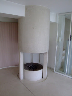
The vaulted volume is the more social area of the house, where kitchen, dining and living rooms melt to create an informal living environment with the fireplace on the highlight. The barrel vault is covered by a layer of apparent bricks applied in a simple way, emphasizing the beauty of its shape and the strategically located skylight. On the wooden’ panels covered  walls, large windows were open in different points  to the surrounding garden, and on the kitchen area a large glazed wall was built above the top cabinets allowing the sunlight to enter, but protecting this family space from the direct views from the street.
In the other volume are located all the private areas of the house: bedrooms, bathrooms and a home office. The 2 levels, plus the basement, are organized through a large staircase that works also as a distribution point and a storage area on the different levels. On the different spaces there’s windows strategically located providing views to the garden.
On the outside have been used natural apparent bricks and dark wood, with exception of the southern façade where a geometrical composition of wood columns and white wooden panels have been used.  Even though there’s seems to have been some problems during the construction between the architects, the clients and the construction responsible, the project manage to keep its integrity and its interesting geometrical composition.

Sunday, 18 September 2011

Villa Bjart Mohr – Bjart Mohr


 The Villa Bjart Mohr, in Heyerdahlvei 6, Oslo was designed by the architect Bjart Mohr (in the picture above) for himself and his family in the early 1970’s.
Bjart Mohr developed a consistent and high quality work on his own, working independently throughout the years and has therefore a limited production.  For his own Villa, Mohr developed a composition of paralelipipedic volumes, in most part of just one floor high, which correspond to different internal functions: a west box, for the indoor’s swimming pool;  a south box, with a double-high ceiling for the living room, and a basement; a north wing that connects the 2 mentioned volumes and were are located the bedrooms and main entrance; and a smaller volume, for the dining room, that connects the living room with the kitchen(also in the north wing).
The project is well-thought and detailed and the result is a succession of comfortable and well lighten spaces and amazing views to the garden and the fjord. The swimming pool is a wonderful space with a shading system at the windows that allow controlling the light that gets in but at the same time allows the view to the outside. The double level living room is constituted by a more social area on the entrance floor, and a more private one in the mezzanine with a kind of floating library over the first level. The light is always just right and controlled. This volume benefits also from a windows’ stripe right above the slab.
The division of the different areas is made through sliding doors which give the possibility of enclosing the different areas or to create an open complex succession of spaces.
The garden is also a place of interested, of Japanese inspiration, calling out for contemplation and peace with its trellis and paved paths, contrasting dense areas with clear open lawns.
Unfortunately, there’s very little information about Bjart Mohr, but we can point out as his major works two art galleries: one in Hurumlandet (finished in 1971) and another in Holmsbu, for which Mohr got the Houen Foundation prize for architecture in 1971.

Havna Allé


As mentioned previously, the project for Havna Allé included the design of 14 single-family detached houses, erected during the 1930’s, designed by the architects Arne Korsmo and Sverre Aasland. Here are shown some examples of those projects: House nº 9 (above) and House nº 1 (below).

Friday, 16 September 2011

Villa Dammann - Arne Korsmo

 It was in 1932 that Axel Dammann and his wife moved into one of Oslo's most modern villas, located in Havna Avenue (Allé). Dammann was a successful businessman first involved with wine production and later expanded his business to South Africa, South America and Europe investing in orange plantations, wood processing and property.
Havna Allé is a cul-de-sac street planned and designed by the architects Arne Korsmo and Sverre Aasland in a large property owned by Axel Dammann, which included also the design of 14 single-family detached houses, erected during the 1930’s, with Villa Dammann at the top end of the street, for Dammann and his family.
Dammann had been in his youth a long time in the Mediterranean countries to learn about wine. When functionalism was introduced in Norway, the simplicity of the design language was something that he recognized and appreciated from south Europe. He was a competent business man, who rarely left anything to chance and when it came to the design of his personal house he was closely involved in the process. The initial draft for Havna Allé n.15 was quite different from the final constructed house, and in many points resembled Villa Stenersen which was built some years later in Tuengen Avenue for the financier and art collector Rolf Stenersen. But Dammann was not happy with the result and a new proposal had to be designed and built.
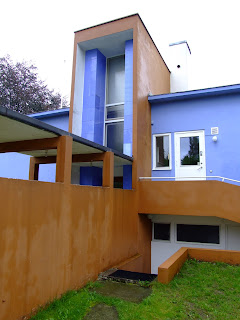
The house was built in reinforced concrete, with bold colours and shapes that caused an intense debate at the time. Articles in architecture magazines and in general newspapers discussed subjects like the functional organization of the house, the materials and furniture which were also carefully chosen by the architects, instead of by the owners, as it was traditionally done. Korsmo and Aasland considered this project as a whole where dimension, light, colours and details should be integrated. Furthermore, they believed  that the spaces should be used in a certain way, and for that to work, the furniture should be chosen by the architects and so, there was steel furniture with pink and brown silk covers, wallpaper that reminded brown paper and out in the hall Korsmo had even painted some “bizarre decorations”.  This topic launched a passionate discussion about the ownership of the house: was it the architects’ house? Or Mr. Dammann’s house?
In this villa a rich selection of techniques and materials have been used, many of them were quite new at the time and their performance had not yet passed the test of time, resulting in some subsequent damages and the need to change certain features, as well as to put together some restoration campaigns to maintain this house in living conditions.
The garden was also taken very seriously, going along with the functionalists and hygienic thoughts of the time, where sun, air and unobstructed views were an imperative. Both the architects and the owners were involved in creating a pleasant outside area for the family.
Villa Dammann, including the garden, received the Houen Foundation prize for architecture in 1937 and is a protected building since 1997 by Cultural Heritage Management Office.

Thursday, 15 September 2011

Arne Korsmo

Arne Korsmo (born August 14, 1900 in Christiania (Oslo), Norway, died August 29, 1968 in Cuzco, Peru) was a Norwegian architect and a leading functionalist and designer who has designed a number of well-known Norwegian villas and a range of products, also taught at the National College of Art and Design and has been a professor at the Norwegian Institute of Technology (NTH), in Trondheim.

Between 1929 and 1935 Korsmo ran his own office together with the architect Sverre Aasland. From then, Korsmo went solo, creating a number of large villas and developing his own interpretation of the functionalist style with a sense of proportions and well thought details. Among his main work was the Norwegian Pavilion at the World Exhibition in Paris, 1937 and the exhibition "We can" in Oslo the following year. In the course of 20 years Korsmo designed 50 villas, several of which are regarded as masterpieces of Norwegian functionalism, including townhouses in Planetveien, Villa Dammann, Villa Stenersen etc.

In Stockholm in 1944, Korsmo met the Danish architect Jørn Utzon, and from 1947 to 1954 they collaborated periodically in a number of projects.

In 1949-50, and together with Grete Prytz (his second wife), ​​Korsmo took a study trip to the United States and Mexico, where he had the opportunity to meet Frank Lloyd Wright and the designers Ray and Charles Eames, which helped him with his own production. In 1952 he organized the Nordic summer course in industrial design with guest lecturers from the United States, event that would stimulated the emergence of this new discipline in Norway, where many of the participants were former students of Korsmo.

Korsmo was Norway’s most internationally oriented architect with connections with the world’s architecture elite at the time, such as Walter Gropius, Mies van der Rohe and Frank Lloyd Wright. In 1950, he was asked by Siegfried Giedion to lead a Norwegian group of CIAM (Congrès International d'Architecture Moderne). Korsmo undertook the mission, and the group was named PAGON (Progressive Architects' Group Oslo, Norway).

From 1956, Korsmo started as a professor of architecture at the Norwegian Institute of Technology, in Tronddheim, where his teachings would take a different and new approach through experiments with light and space based on perceptual psychology, introducing this way the modern international architecture on a personal and inspiring way.
Japan was an inspiration for Korsmo for some years and finally in 1960 he had the opportunity to undertake an extended study trip to Japan. One of the few works from this period in his life was the rebuilding of the Britannia Hotel in Trondheim, where the international trends took again a turn towards the classical.
Korsmo received a number of honours in the course of his career; among others the Sundt award in 1933, and the Houen Foundation award twice, in 1937 and in 1939. He was made a knight of the French Legion of Honour for the Norwegian pavilion at the Paris Exhibition in 1937 and 1939, and was, together with his second wife Grete Prytz, awarded the Grand Prix at the Triennale in Milan in 1954 (being the only Norwegian architect awarded with such prize).

In 1968 Korsmo travelled together with Grete to Huampani near Cuzco in Peru to participate in a conference for designers. He had always dreamt of getting to see the ruins of the monumental megalithic architecture of the Incas. But having struggled with poor health for several years, Arne Korsmo ended his life on this arduous trip to Machu Picchu in Peru on 29 August 1968.

Wednesday, 14 September 2011

Villa Stenersen - Arne Korsmo

Villa Stenersen, on Tuengen Avenue in Oslo, was designed in 1938 and completed in 1939, by Arne Korsmo, one of Norway's most renowned architects. Korsmo is known as an internationally oriented architect, who travelled both in Europe and USA and got in touch with some of the biggest names in architecture of the time.
Villa Sternersen was, besides being a family home, an art gallery for the private collection (which included Paul Klee, Picasso, Cezanne, Kadinsky and Munch) of the successful builder and financer Rolf Stenersen, aspects which give the house some of its unique characteristics. Surrounded by more traditional houses, Villa Stenersen stands out by its linear volumes and bright colours and several stories are told about one of the main works of Norwegian Functionalism, including that its construction created such dramatic reactions in the neighbourhood that one of the neighbours sold his house so he didn’t have to see the villa every day.
Arne Korsmo was already a famous architect in his time, he was familiar with the latest tendencies in Europe, and this was something that Rolf Stenersen knew how to appreciate. Stenersen intended a place to house his large collection of contemporary art and his only two requirements from Korsmo was to have a gallery hall and a gallery staircase, giving the architect full freedom both economically and aesthetically.
Korsmo was familiar with Le Corbusier five points for architecture developed in the 1920’s and published in Vers une architecture, succinctly: 1- structure with pilotis – reinforced concrete stilts; 2- free façade, meaning non-supporting walls; 3- open floor plan; 4- long strips of ribbon windows and 5- roof garden.  Korsmo didn’t follow exactly Le Corbusier’s formula but opted for the use of a concrete box resting on pilotis, using geometrical volumes to define all different areas. The main facade is broken up with full windows on the first floor, glass block in the second and blue glass panels in the third. This was possible due to the relatively new developed system of reinforced concrete skeleton which assured all the supporting functions allowing the walls to "hung" on the outside and the use of entire glass surfaces, permitting also the use of an open floor plan.
Korsmo used both straight and circular lines as well as volumes, namely in the cylindrical main entrance door and in the garage. The garage is located in the house's basement and is semicircular with gates at each end, so it should be functional and convenient for Mr. Stenersen to run in and out without reversing which, has been said, he was not very good at.
Against to what is very often thought, Functionalist architecture was not black and white, both in the Bauhaus school in Germany and Le Corbusier's first buildings in France strong primary colours were used to create sharp contrasts in the interiors. Different colours were often used on the walls, floors and ceilings which architect Korsmo used to study how colours in the interiors could affect the people who used them.
On the second floor, the gallery hall shows the reinforced concrete skeleton clearly marked by the continuous columns and beams in the ceiling. For the outer wall Korsmo designed originally the whole wall with glass blocks, but Mrs. Stenersen felt differently about it and recessed windows were incorporated. Korsmo thought that one could enjoy the amazing view from the balcony and that inside one should concentrate only on the art hanging on the walls.
Villa Stenersen is clearly divided into two zones; representation zone (1st and 2nd floors) and private zone (3rd floor). The private zone consists of bedrooms for the family and employees. The roof of the gallery stairs on the third floor is worth noting. It consists of 625 circular glass pots in cobalt, violet and pale blue which would allow just the right light to admire the paintings in this section of the stairs without the need electric light.
Rolf Stenersen donated the villa to the Norwegian state in 1971 to house the prime-minister or as a representation place, unfortunately that rarely happened. Since 2000, the Foundation for Design and Architecture in Norway, administers the use of the villa on behalf of the Norwegian Ministry of Culture. Nowadays, contemporary artworks on loan from the private collection of Sten Stenersen jr. are displayed in the house.

Saturday, 2 July 2011

The eyes of the skin


The book “The eyes of the skin. Architecture and the Senses” was written by the Finnish architect Juhani Pallasmaa (1936) and it was firstly published in 1996. Since then the book has become a success, read all over the world, reprinted several times and obligatory reading in several architecture schools.

The book is structured in 2 main chapters: the 1st one where Pallasmaa analyses how the Western culture got to the present point where architecture is only seen as a “visual” phenomena, starting with the philosophical writings from the Ancient Greece, going through the Renaissance and the invention of perspective, until the 20th century where the first philosophers start criticizing the “Ocularcentrism” of Western culture. References to Descartes, Satre, Merleau-Ponti, Derrida, Hall, etc. try to remind architects that the human body has more the one sense, and that vision might not be the most trustworthy of them as well as bring to the centre of discussion that a space can and should be felt with the other senses. For some of the most influent architects of the last century like Le Corbusier, Gropius or Mies van der Rohe, vision was if not the only way, at least the most important way to look at and feel architecture, even though their writings and their final spaces might be contradictory. This trajectory culminates on the present day, where spaces are built to be shown on magazines and to continue feeding this hunger for the glossy images at the same time that the spaces themselves are unfriendly and uninviting to the senses.

On the 2nd part of the book, Pallasmaa recognizes the importance of sight, but warns us for the danger of total disregard for the other senses. Instead, he proclaims a “sensory architecture” where all senses should be present and interact in between themselves. In this way, the Finnish architect emphasizes the importance of the touch, the sound, the scent and even the taste of buildings and city as fundamental means to encounter our own place in the world, to create our memories / identity, to motivate our imagination, etc, turning architecture in such a metaphysical and poetic world, way beyond the idea of architecture as a simple shelter. Also, Pallasmaa writes in such a passionate and sensual way that makes nearly impossible to resist to start caressing, smelling and licking the buildings around ourselves.

At some point, Pallasmaa writes “The ultimate meaning of any building is beyond architecture; it directs our consciousness back to the world and towards our own sense of self and being. Significant architecture makes us experience ourselves as complete embodied and spiritual beings. In fact, this is the great function of all meaningful art.”

Saturday, 1 January 2011

Made in Norway – Norwegian architecture today


The book “Made in Norway – Norwegian architecture today” was recently published by Birkhäuser and it presents itself as a collection of the best, or the more photogenic at least, projects of the last few years in Norway or by Norwegian architects.

Starting with the title, Made in Norway would have been enough and open enough to incorporate what is presented in the book. The attached “Norwegian architecture today” is ambiguous and misleading as it is to talk about any “national” architectural style nowadays for several reasons: 1- if by Norwegian it was meant projects built in Norway then the Royal Norwegian Embassy in Nepal from Kristin Jarmund for example shouldn’t have been included; 2- if by Norwegian it was meant projects designed by Norwegian architects, then the Knut Hamsun Centre by Steven Holl shouldn’t have been included; 3- nowadays, people and information travel faster than ever, so it’s nearly impossible to talk about a “national” architecture since behind the big names of the offices there’s a large amount of people from all over the world or with educations from abroad which necessarily influence the projects making them “un-national”; 4- there’s little, if anything, in common in all the projects presented, neither formal, constructive, material nor conceptually speaking.

In the globalized and more or less democratic world of today it makes little sense to discuss “national” architecture. The discussion of today should be centered in architecture as a discipline and in its capacity to relate with the local society and to answer people’s needs (in terms of economics, politics, environment, etc) and less in the country where some architect was born. For these reasons, Made in Norway (which can incorporate designed or built) would have been the most appropriated title.
 
Otherwise, the book makes up a nice introduction to some of the more mediatic buildings designed or built in Norway. The projects presented include different programs (museums, schools, houses, parks, embassies, bridges, etc.) from different architects like Steven Holl, Kristin Jarmund, Sverre Fehn, Helen & Hard, Reiulf Ramstad, Snøhetta, etc. More interesting than the pictures themselves are a collection of texts, interviews and essays that help to give an understanding on how the different offices get to the different results in Norway.

Thursday, 30 December 2010

House of Stories, Cascais, Portugal

Recently opened, Paula Rego’s House of Stories (Casa das Histórias), located in Cascais in the surroundings of Lisbon, has created a small fuss in many different ways. To start, the rare fact that the architect Eduardo Souto de Moura has been personally chosen by the artist to design “her” museum, after she’d been impressed by the architect’s work, namely  the London Serpentine pavilion of 2005 designed by Álvaro Siza and Eduardo Souto de Moura, and Souto de Moura’s Braga stadium (2000).

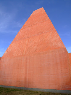
Also interesting is the fact that it was a key-architect from the so-called “Oporto’s School” to design a building in Lisbon, which doesn’t happen very often, bringing up, once again, the tedious discussion about Oporto’s architects in the north and Lisbon’s architects in the south. Eventually following the “south’s influence”, and specifically, Cascais’ type of architecture, Souto de Moura didn’t go for the rational white walls and raw natural materials, but instead, let himself  get involved with more “palatial”  forms and colours which integrated the building perfectly in the place and in the place’s history.

Souto de Moura had the rare opportunity of designing a museum for a specific collection and artist, instead of the general art museum for the general collections that are the big majority of the museums built nowadays.

The museum was built in between mature existing trees whose shadows on the walls create an interesting effect, an alive canvas that changes according to the sun, creating drawings and pictures not too far from Paula Rego’s work itself. The few openings to the exterior are controlled and calculated to strategic points, both from the outside and from the inside. Inside, the large high ceiling rooms contrast with others more intimate and domestic, pretty much the perfect place to tell Rego’s stories.

The museum’s permanent collection is made up of 257 etchings and 278 drawings, many of which have never been seen before, that Rego has donated to the foundation. She has also loaned 52 paintings, many from the 1980s (for example the Operas series); and certain works from the 1960s and 1990s. Willing, apart from being husband and father to her three children, was a hugely important figure in the development of her work, and he is represented in the collection with 15 oil paintings.